After the research I went on with my character and decided to create several color palettes until I got one that resembled "summer".
Looking at inspirational pictures and fiddling around with the color scheme designer on paletton.com helped broaden my horizon.
Eventually I liked the combination of fresh colors Lime Green, Turquoise, and Coral Red. Yellow accents were used to give the character a royal edge and because he represented summer his skin was tanned. At first I liked the combination on Lime Green and Warm Yellow with a little accent of Coral Red (sash and hair) but when I applied this scheme to the 3D model the colors stood out against each other more then they did in the design. Another problem was that yellow pants and upper body elements made it hard to focus on one area and made the design look "flat". Making the pants darker resulted in an ugly shade of yellow I didn't like, so that color palette was abandoned.
Just like I did with sculpting I began blocking in the colors to tune them and see if the design worked. The eyes didn't stood out as much as I wanted to because they are too small so I'm going to make the face brighter. I also removed the yellow trims from the boots and gloves because they were drawing too much attention away from the face and upper body.
In Zbrush it's possible to sculpt and color at the same time. Unfortunately my design didn't involve any color schemes, which also happened to be my weak link. Most of my work it is either in black and white or done without proper knowledge of how to use colors. "Trees are green, right? Water is blue!"
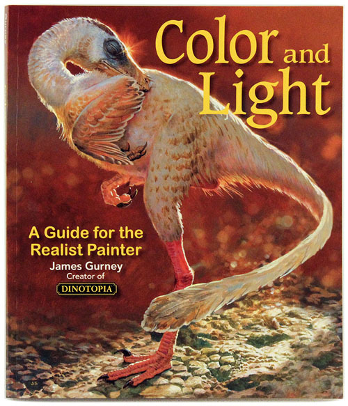
I spent a long time looking at various video tutorials on how to choose a colour palette for game characters, how colours work and read the book "Color and Light" by James Gurney.
From the character color tutorial I learned that you should choose only one saturated color which becomes the main color of the character and is supported by one or two low saturated or neutral colors. Then there is one more color (mostly complimentary to the main color) which has the highest saturation and/or brightness and is used to create small accents to catch the viewers eyes.
The book "Color and Light" was intended for traditional painting but it's theory applies to all fields of art. In the book Gurney talks about how lighting affects an object colors and how this is used in composition.
Creating colors from imagination requires a lot of understanding on how colors work. Tutorials help on giving you the basic knowledge but to apply it takes a lot of practice,
This holiday I had the opportunity to spend more time working on my model in Zbrush. I came across a multiple of problems in my model that wasn't a problem in Maya. Most of of my problems involved border edges. My hair model was built out of two separate models one was the "outer" hair which would be visible most of the time. The other part was the "inner" hair, which was the backside of the bangs and would only be visible when looking up the character. Merging the edges of the bangs together caused shader issues, so I kept them apart.
When smoothing the model in Zbrush, the border edges were smoothed out as well, resulting in a gap between the two meshes. A solution I found on the internet would be to turn off the "smooth edges" option altogether, creating blocky lines all over the mesh. More searches didn't help and I figured it would be easier to re-make the hair in Zbrush then to spent more hours looking for a solution. The curl looked good on the design but was an eyesore on the 3D model so I removed it.
I moved around the ears and eyes a little so it would be more anatomically correct.